SSHEN

Incorrect password.

000%

INITIALIZING

SSHEN ← PRODUCT DESIGN WORK

LA STAP DISPLAY DESIGN

  1. 00ABOUT
  2. 01CHALLENGE
  3. 02RESEARCH
  4. 03SOLUTION
  5. 04VALIDATION
  6. 05FINAL DESIGN

0% READ

LA STAP Display Design

Real-time e-ink displays for the bus shelters of LA's Sidewalk Transit Amenities Program (STAP), so riders can see arrivals, weather and alerts at a glance.
CLIENT
City of Los Angeles
STUDIO
BMW Group Designworks
ROLE
Product & user research, interaction design
TIMELINE
Nov 2022 – Jun 2023
PLATFORM
E-ink shelter displays
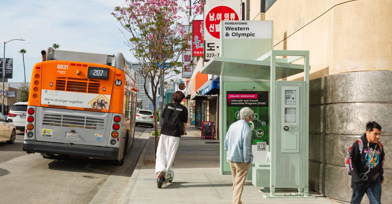
A new STAP bus shelter in Koreatown at Western and Olympic, with its display column beside the bench

0K+

BUS SHELTERS CITYWIDE

0K

RIDERS EACH WEEKDAY

0+

RIDERS INTERVIEWED

CHALLENGE

How might we improve bus signage to make the LA bus journey more user-friendly and accessible?

CLIENT GOAL

Provide shade and heat relief for commuters in high-ridership areas, with shelters ready for the 2026 Super Bowl and the 2028 Olympics.

INTERNAL TEAM

Creative director, UX design lead, product manager, 3 interaction designers and 2 industrial designers.
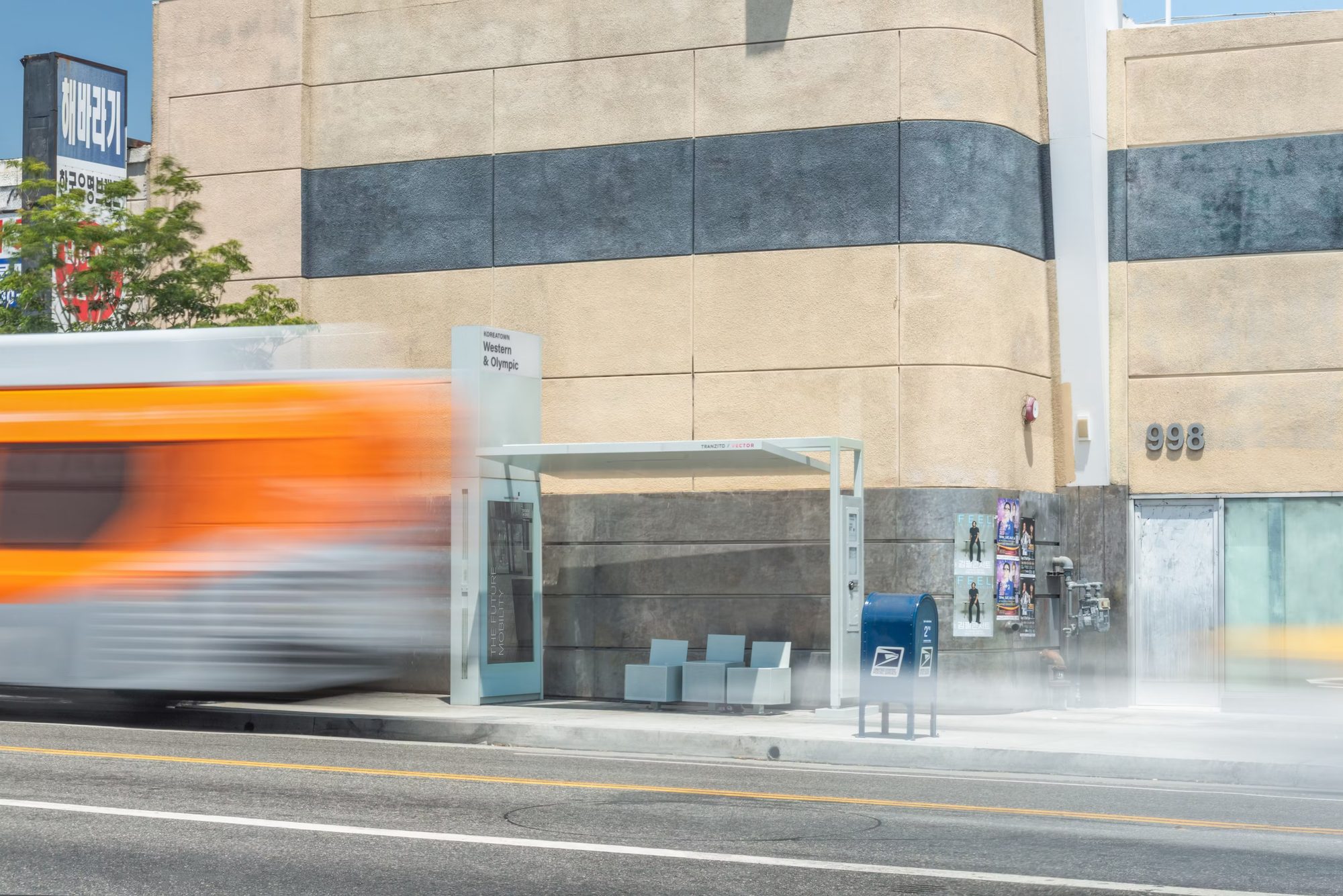
A bus speeds past a new STAP shelter on a Los Angeles street

PARTNERS

DEVELOPER
Tranzito-Vector
ARCHITECTURE
Skidmore, Owings & Merrill (SOM)
UI / UX
Designworks, a BMW Group company
URBAN DESIGN
Studio One Eleven
FABRICATION
Tolar Manufacturing
LIGHTING DESIGN
HLB Lighting

RESEARCH

DESK RESEARCH

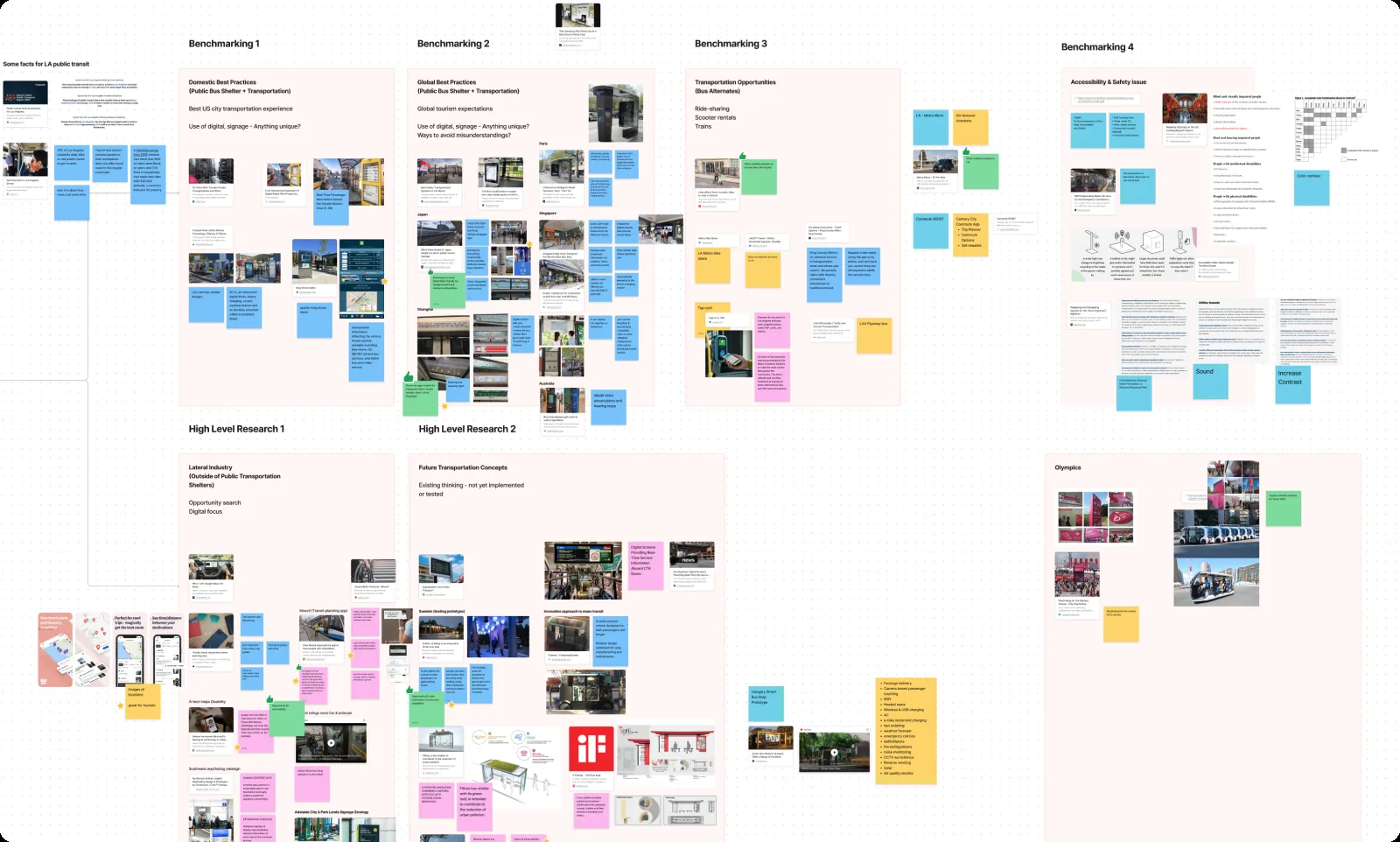
Board benchmarking transit signage from cities around the world

Studied domestic and global practices for ideas on where transit signage could go next.

FIELD IMMERSION
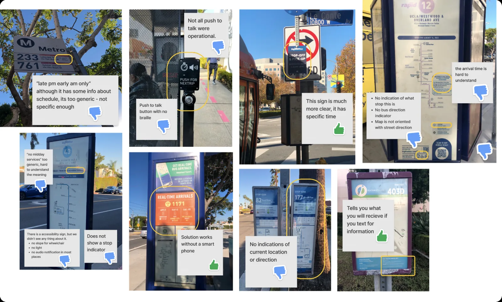
Annotated photos of LA bus stops and their signage

Rode LA buses, photographed stops along the way and evaluated their signage.

USER INTERVIEWS
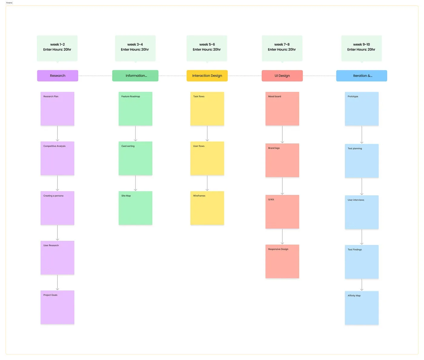
Project timeline board, from research to iteration

Interviewed 30+ LA bus riders with the internal team: commuters, tourists, event attendees, riders with disabilities and multilingual riders.

PAIN POINTS

P1
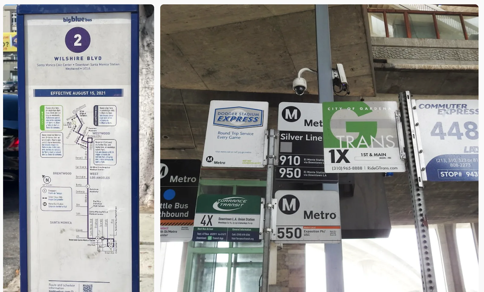
Chaotic transit signage

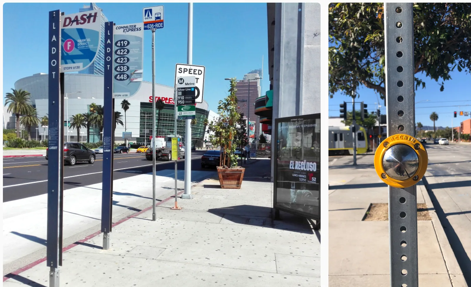
Signs from different transit agencies crowded onto one pole

Mixed transit branding and cluttered signs make it slow and hard to find what you need.

P2
Lack of real-time information

Static stop signs and a call button with no arrival times

Most stops rely on static signs, so riders can't see arrivals or delays.

P3
Lack of human-centered experience

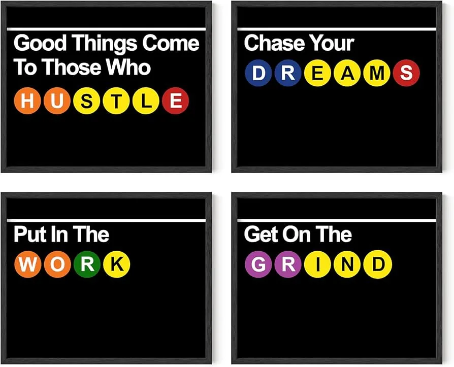
Transit-styled posters as an example of a playful identity layer

Most LA bus stops lack a cultural or identity layer, with very little human touch.

SOLUTION

One answer to each pain point, built into the same two-screen display.

S1
Unified display system

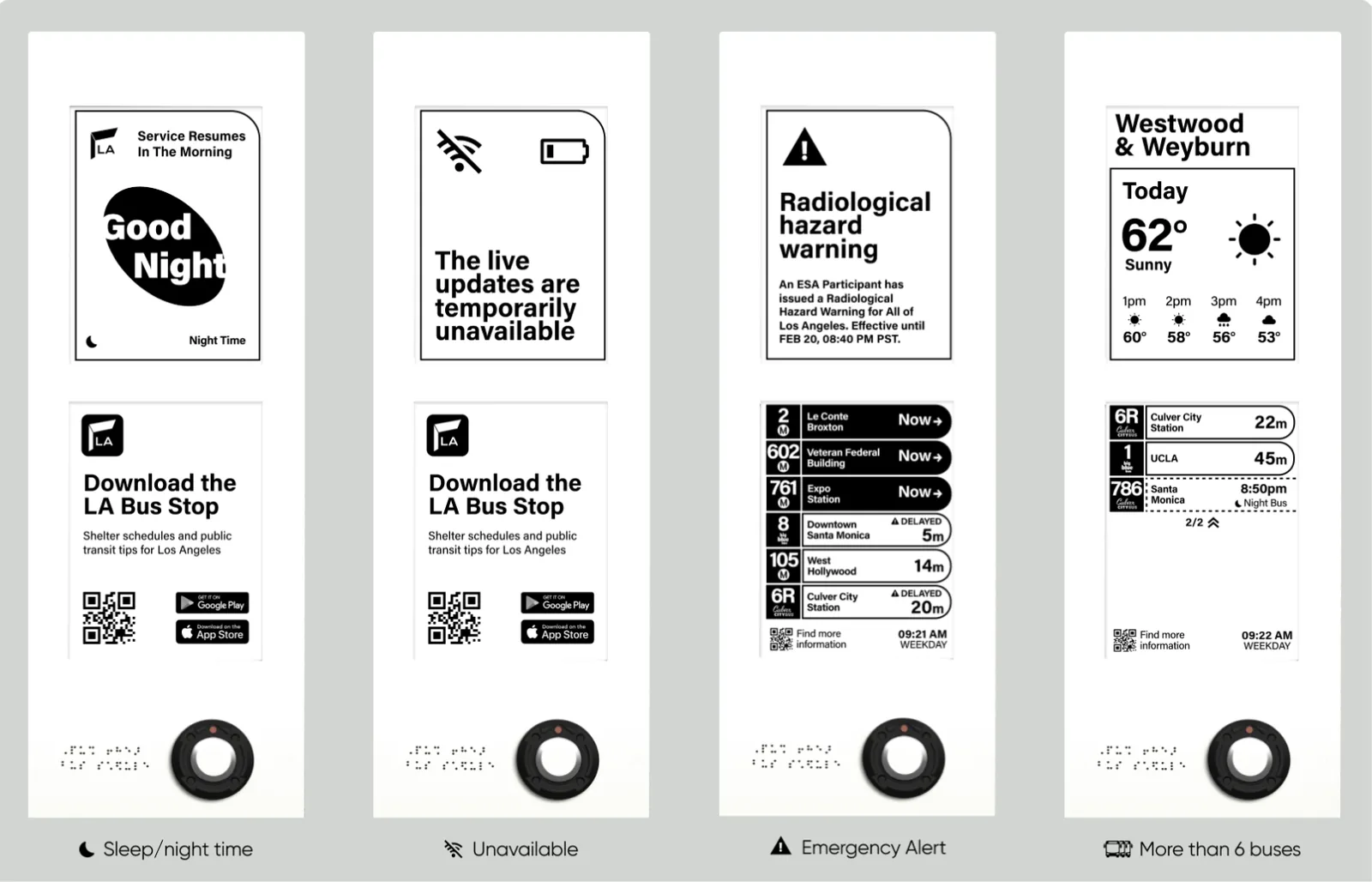
Four display states side by side, sharing one layout

ANSWERS P1 One layout at every stop: a message or forecast on the top screen, arrivals on the bottom, in the same type and icons.

S2
Real-time info display

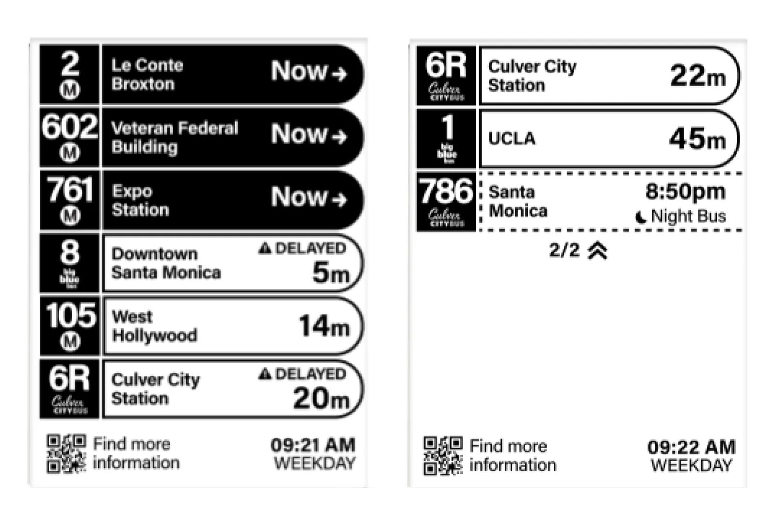
Two pages of live arrivals with Now, minutes, Delayed and Night Bus states

ANSWERS P2 Live arrivals with route, destination and minutes, plus Now, Delayed and Night Bus states. More buses page over.

S3
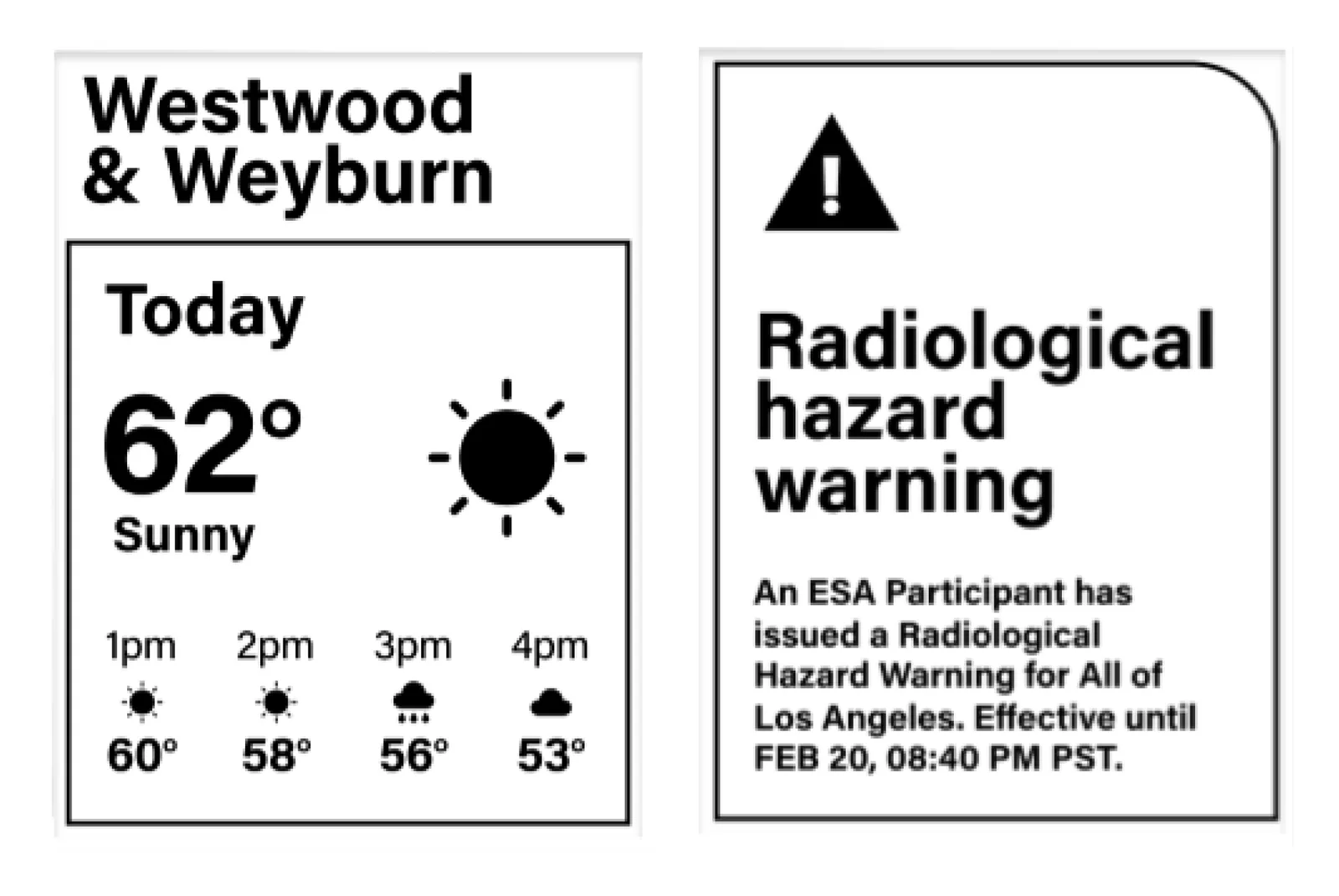
Weather forecast for confident travel

Weather for Westwood and Weyburn next to a radiological hazard warning

ANSWERS P3 The stop's name and today's weather, hour by hour. In an emergency, one alert takes over the screen.

VALIDATION & TEST
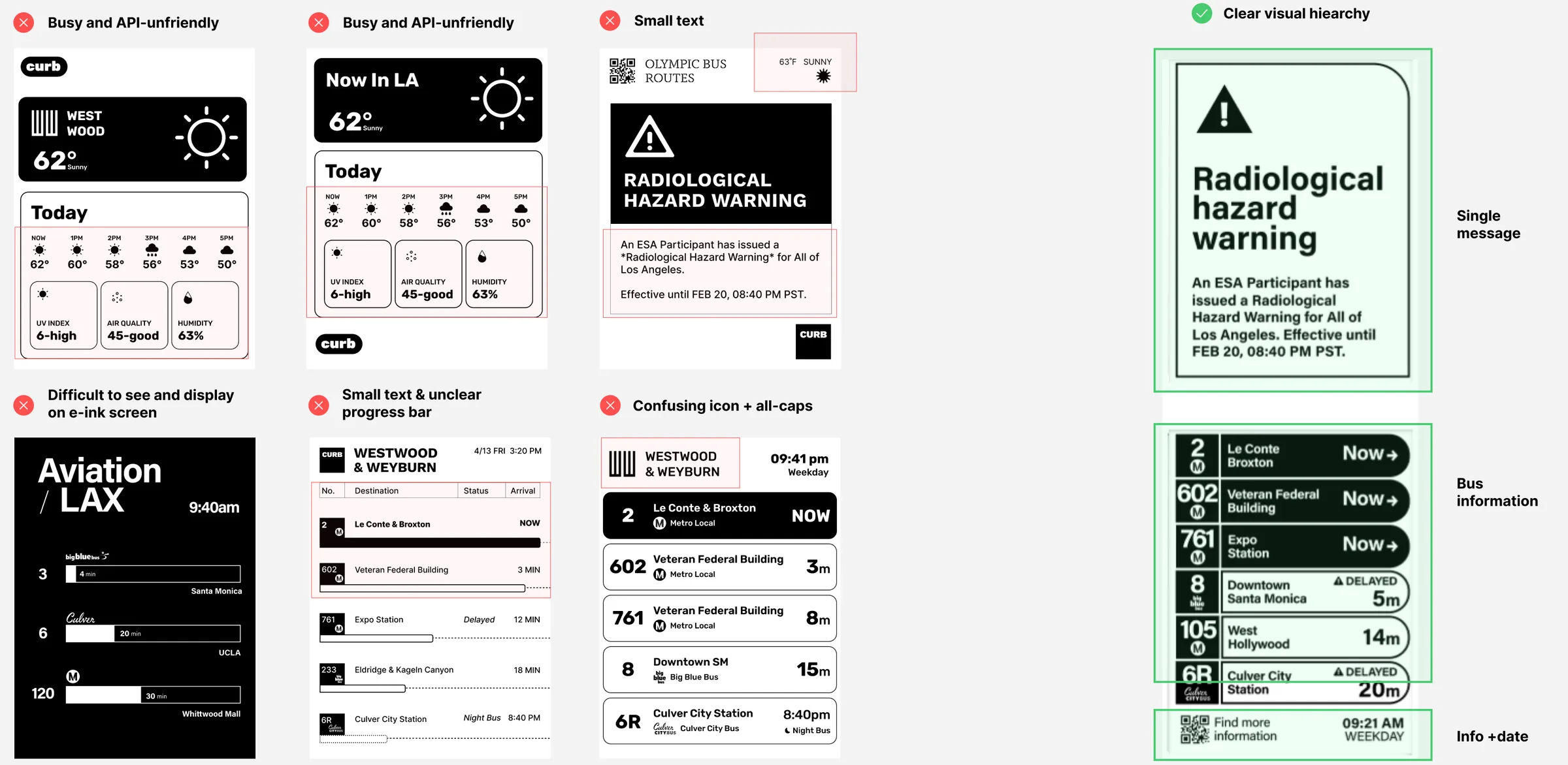
Explorations

BUS SHELTER PHYSICAL DISPLAY
Six rejected layouts marked with their problems, next to the chosen layout

CUT

  • Weather cards with UV, air quality and humidity were too busy and hard to feed from the data API.
  • Small text, unclear progress bars, confusing icons and all caps slowed reading.
  • Dark, dense layouts were hard to see and to render on an e-ink screen.

KEPT

  • A clear hierarchy with a single message on top.
  • Bus information in the middle, one row per route.
  • A QR code for more, then the time and day.

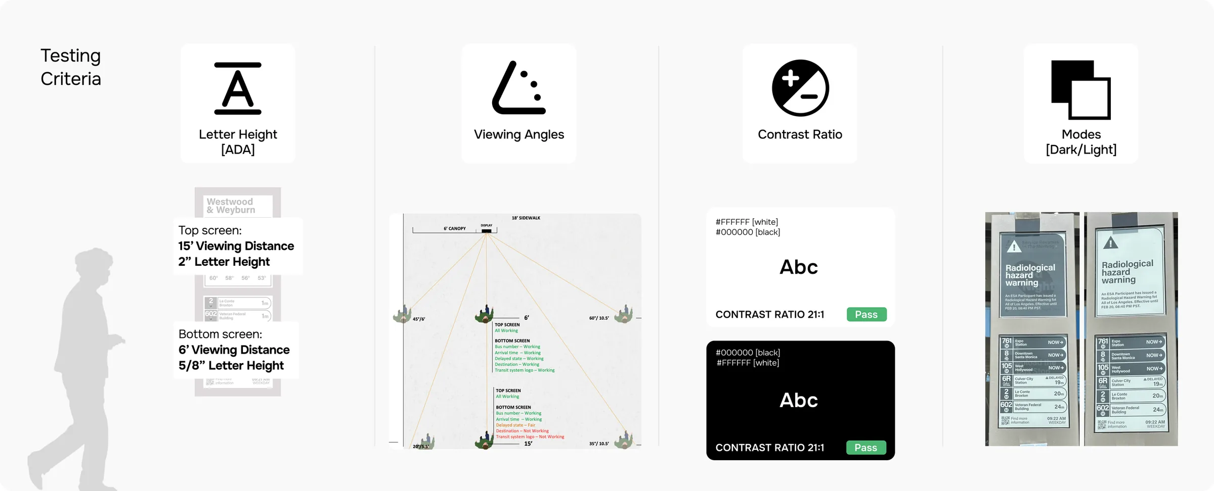
Testing criteria

ON SITE
Testing criteria: letter height, viewing angles, contrast ratio and dark and light modes
LETTER HEIGHT (ADA)
Top screen read from 15 ft with 2 in letters; bottom screen from 6 ft with 5/8 in letters
VIEWING ANGLES
Checked what stays readable from points across the 18 ft sidewalk
CONTRAST RATIO
Black on white and white on black, both 21:1
MODES
Dark and light layouts compared on the real e-ink panels

FINAL DESIGN

One display that knows what to say at every hour, including when there's nothing to show.
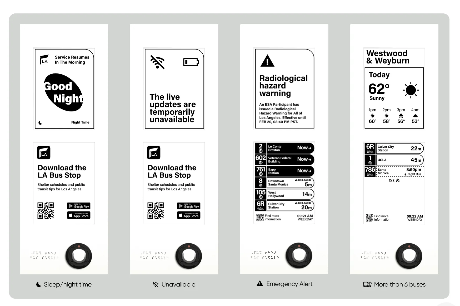
Final designs

Four final display states: night time, unavailable, emergency alert and more than six buses
SLEEP / NIGHT TIME
Good Night, with when service resumes in the morning
UNAVAILABLE
Says live updates are temporarily down and points to the LA Bus Stop app
EMERGENCY ALERT
A single warning takes the top screen; arrivals stay below
MORE THAN 6 BUSES
Arrivals split across pages, marked 1/2 and 2/2

On the street

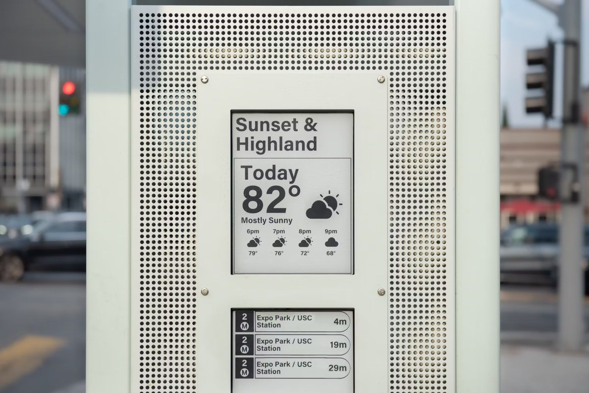
SUNSET & HIGHLAND
The shipped display at Sunset and Highland showing 82° and the next three arrivals
ALL CASE STUDIES Product Design Work→
HOMEBACK TO TOP©SHAYNE SHEN 2019–2026 ALL RIGHTS RESERVED.